

The hardest canvas in asset management is not a report or a dashboard. It is a rectangle of adhesive polyester about the size of two postage stamps. Onto that small space people want to squeeze a barcode, a human-readable ID, the company logo, the asset name, sometimes a phone number and a "property of" line — and then they wonder why the finished tag looks cramped and refuses to scan on the first pass.
A good small label is an exercise in subtraction, not decoration. The skill is deciding what earns its place, and then giving each survivor enough room to do its job. Get that right and a tag the size of a stamp will be scanned and read reliably for years; get it wrong and you reprint a thousand labels.
Start from the tag size, not the design
Before you place a single element, fix the physical size of the label and never lose sight of it. A tag destined for a laptop lid, a chair frame or a water meter might be 38mm by 19mm; a tag for a large machine might be 50mm by 25mm. Design at the true size on screen, not zoomed in to a comfortable working scale, because a layout that feels balanced at 400% will feel suffocating at 100%. If your design tool shows a real-size preview, keep glancing at it.
This sounds obvious, yet it is the mistake I see most often. People choose the elements first, arrange them beautifully on a generous working canvas, and only discover the crowding when the printer spits out the first tag. Working the other way round — committing to the millimetres before anything else — quietly disciplines every later decision. When you know you have only nineteen millimetres of height to spend, you stop arguing about whether the logo belongs on the label; the space itself makes the call for you.
Give the barcode room to breathe
The single most common cause of a label that will not scan is a barcode with no quiet zone — the empty margin a scanner needs on either side of the bars to find where the code starts and stops. Crowd text or a border up against the bars and even a perfect print becomes unreliable. As a rule of thumb, leave a clear margin at least ten times the width of the narrowest bar on each side, and never let a logo or the label edge intrude into it. If you are unsure which code to print in the first place, the trade-offs are covered in our guide to barcode symbologies.
Treat that empty margin as part of the barcode, not as wasted space you are entitled to reclaim. The instinct to fill every gap is strong, especially on a small tag where blank areas look like an opportunity, but the scanner reads that blankness as a signal, not an absence. A helpful habit is to draw the quiet zone as a visible box while you work and only remove it before printing, so you can see at a glance whether a stray line of text or a border has crept into the one area that must stay clear.
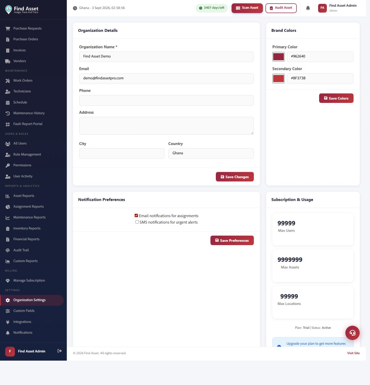
A small label has no room to waste. Find Asset's settings (above) control how asset codes are structured, so you can keep them short enough to sit cleanly on a compact tag without losing meaning.
Decide the hierarchy: what earns space
On a small label, every element competes for the same scarce millimetres, so rank them honestly rather than pretending everything can coexist. The discipline is to sort each candidate into essential, useful, optional and luxury before you place a single one, and then to build outward from the essentials only as space allows. The table below is the ranking that survives contact with real tags, where the barcode and a legible identifier consistently outweigh anything decorative that competes with them for room.
| Element | Priority | Why |
|---|---|---|
| Machine-readable barcode | Essential | Scanning is the whole point of the tag |
| Human-readable asset ID | Essential | Read aloud when a scanner or battery fails |
| "Property of" line | Useful | Deters casual theft, aids return |
| Logo | Optional | Adds polish, first to drop if tight |
| Asset name / phone | Luxury | Usually more than the space can afford |
When in doubt, leave it out; a clean tag that scans beats a busy tag that does not. The hardest part of this ranking is emotional rather than technical, because someone always wants the logo bigger or the department name added, and each request seems reasonable on its own. Holding the line is easier when you remember that the label exists to be scanned and read under pressure, not admired up close, and that every element you drop makes the two that truly matter that much easier to use.
Typography that survives distance and smudge
Labels are read in bad light, at arm's length, sometimes through a film of dust. That rules out delicate fonts. Choose a plain, sturdy sans-serif and set the asset ID as large as the space allows — legibility of that ID is worth more than any other refinement. Keep to one typeface and at most two sizes; each extra font fragments the little space you have. Favour bold weight for the ID and avoid italics and condensed styles, which blur when printed small on a thermal printer.
There is a practical test for whether your type choices will hold up: print the tag, drop it on the floor, and try to read the asset number while standing over it. If you can call out the number cleanly from a metre away, the font is doing its job; if you have to crouch, it is too small or too fine. Remember that the human-readable ID is not decoration — it is the fallback that keeps an audit moving when a scanner battery dies or a code gets scuffed, so it deserves the boldest, clearest treatment on the whole label.
The small-label checklist
- Design at 100% real size, not zoomed in.
- Protect the barcode's quiet zone on both sides — nothing intrudes.
- One barcode, one large human-readable ID; everything else is optional.
- One sturdy sans-serif, two sizes maximum, bold for the ID.
- Black on white, matte material — the highest scan rate there is.
Respect the thermal-print reality
Most asset labels come off a thermal printer that knows only black and the absence of black. Design for that. The most reliable combination on earth is black on white, and nothing you invent will beat it — reversed white-on-black barcodes, grey tints and subtle colours all reduce the contrast a scanner depends on. Material matters too: a shiny label reflects a scanner's light and defeats it, so a matte finish reads more dependably, and for anything handled hard, a durable synthetic label resists the smudging that turns a crisp code into a blur.
It helps to think of the thermal printer as an honest but literal partner: it will faithfully reproduce exactly what you send, including any subtlety you hoped would render nicely. A gradient becomes a muddy band, a light grey becomes patchy, and a hairline stroke can simply vanish where a single row of dots fails to burn. Designing within the medium's plain black-or-nothing logic is not a limitation to resent but the surest route to a tag that looks the same on the thousandth label as it did on the first proof.
Test before you print a thousand
The cheapest mistake to fix is the one you catch on the first tag. Print a single label at real size, stick it on the actual surface it is meant for — the curved leg of a chair, the textured casing of a pump — and scan it from the distance and angle a real operator would use. Curved and shiny surfaces defeat many designs that looked fine on paper. Only when a single tag passes both a scan and a read-aloud test do you commit to the full run.
Build this proof step into the workflow so it never gets skipped under deadline pressure, because the temptation to send the whole batch straight away is strongest exactly when you can least afford to be wrong. A single wasted label costs pennies and two minutes; a wasted reel of five hundred costs real money and, worse, sends a team out to apply tags that will fail during the very audit they were printed for. Testing one is the closest thing labelling has to insurance, and it is almost free.
Bringing it together
The measure of a good asset label is not how much information it carries but how reliably it does its one job: to be scanned and read, quickly, on a small surface, for years. Size to the tag, protect the quiet zone, rank ruthlessly, print black on white, and test one before you print a thousand. If you would like to design and preview labels at true size before committing to a print run, you can start a free 14-day trial and lay out your first tag in minutes.
None of these habits is difficult, and that is rather the point. A reliable small label is not the product of clever tricks but of a handful of restraints applied every single time, until they become the way your team simply does labels. Master subtraction on the smallest canvas you own and every larger tag becomes easy by comparison, because you will have learned the discipline that separates a register you can trust from a drawer full of stickers nobody can quite read.