
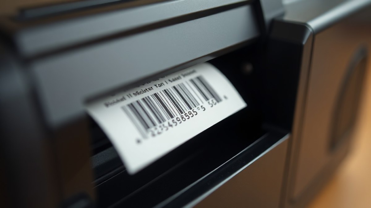
A label looks fine on the screen, sails through the design preview, and then fails the moment it meets the real world. The barcode smudges after a week on a generator housing in Tema, the text is too small to read across a store room, or a scanner refuses it three times before a warehouse clerk gives up and types the number by hand. Almost every one of these problems is a design decision made months earlier, not a fault in the printer or the scanner.
Zebra thermal printers are unforgiving in a useful way: they will faithfully reproduce whatever you send them, including your mistakes. A barcode drawn a fraction too small, a font chosen for looks rather than legibility, or a quiet zone squeezed to nothing will all print exactly as designed and fail exactly as designed. The good news is that a clean, durable label follows a short list of rules, and once you build them into a template you never have to think about them again. This guide walks through those rules in the order they matter.
Design at the printer's real resolution
The single most common cause of fuzzy barcodes is designing at the wrong resolution. Most desktop Zebra units, such as the ZD421, print at 203 dots per inch (dpi); higher-end models run at 300 dpi. At 203 dpi, a single dot is roughly 0.125mm wide, and every element on your label is ultimately built from those dots. If your narrowest barcode bar does not land cleanly on a whole number of dots, the printer rounds it, and rounding is where scannability quietly dies.
The practical rule is to know your printhead resolution before you draw a single element, and to size barcodes so their narrowest bar (the "X dimension") is a clean multiple of the dot size. On a 203 dpi head, an X dimension of 2 dots gives you about 0.25mm, which is a safe minimum for most handheld scanners. Designing a label at 300 dpi and sending it to a 203 dpi printer, or the reverse, is a guaranteed route to blur.
Protect the quiet zone around every barcode
A barcode is not just the bars. Every symbology needs a clear margin of blank space on either side, called the quiet zone, so the scanner can tell where the code begins and ends. For a 1D barcode like Code 128, the quiet zone should be at least 10 times the X dimension on each side; for a QR code, a margin of four modules all round. Crowd that space with a logo, a border, or another field, and scanners start hesitating.
This is where tidy visual instincts work against you. Designers naturally want to fill the space and centre everything neatly, but a barcode pushed hard against the edge of a 50mm label, or boxed in by a decorative frame, loses the very margin it depends on. Leave the quiet zone empty and treat it as part of the barcode, not as wasted space.
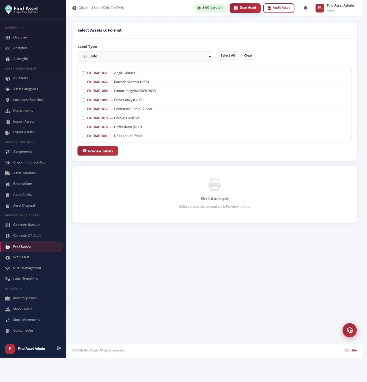
A clean Zebra label is as much about the software as the sticker. Find Asset's Print Labels screen (above) handles the layout and sizing that keep a barcode crisp and scannable at real thermal-print resolution.
Give the barcode enough height and the right symbology
Height matters more than people expect. A barcode that is too short forces the operator to aim precisely, which slows every scan and increases failures at odd angles. As a rule of thumb, make a 1D barcode at least 6mm tall, and ideally closer to a quarter of its width, so a scanner sweeping across at a slight tilt still catches a full slice of bars. QR codes are more forgiving of angle but need adequate module size to survive a worn surface.
Symbology choice is just as important as size. Code 128 packs alphanumeric asset tags densely and scans reliably, which makes it a sound default for one-dimensional tags. QR codes hold far more data in a small square and tolerate partial damage, which suits small equipment and any label that might get scuffed. If you are weighing the two, our note on the practical trade-offs is worth a look before you settle on a house standard and roll it out across every asset class you own.
Choose fonts and text sizes a human can actually read
The human-readable part of the label matters as much as the machine-readable part, because scanners break and clerks fall back to typing. Use a plain sans-serif font, avoid condensed or decorative typefaces, and never go below about 6 to 8 points for the asset number. Thin hairline fonts vanish on thermal printers because a single missing row of dots can erase a stroke.
Keep contrast absolute: pure black on the label stock, no grey fills, no gradients, no reversed white-on-black text for anything small. Thermal printing is a binary process — a dot either burns or it does not — so anything relying on shades of grey will look muddy. A short, high-contrast asset number in a clear font is more valuable than a beautifully styled label nobody can read from two metres away.
A clean Zebra label at a glance
- Design at the printer's true resolution — 203 or 300 dpi — never guess.
- Keep the barcode's narrowest bar a clean multiple of the dot size.
- Leave the quiet zone empty: at least 10x the X dimension for 1D codes.
- Make 1D barcodes at least 6mm tall so tilted scans still catch full bars.
- Pure black, plain sans-serif, minimum 6 to 8 point for readable text.
Match the material to where the label will live
A perfectly designed label on the wrong material still fails. Direct thermal labels are cheap and print without a ribbon, but the image fades under heat, sunlight, and abrasion — fine for a document that lives in a drawer, poor for a pump running outdoors in the Accra sun. Thermal-transfer labels, which melt a ribbon onto durable synthetic stock, survive years of handling, chemicals, and UV. For fixed assets you expect to track for their whole life, thermal transfer on a polyester or polypropylene face stock is almost always the right call.
Adhesive and size deserve the same thought. A general-purpose adhesive will lift off a warm, oily, or textured surface within weeks, so specify a high-tack or specialist adhesive for machinery and outdoor gear. Size the label to the smallest sensible footprint that still holds a scannable barcode and a readable number — a common, well-proven format is 50.8 by 25.4mm, which fits most equipment without crowding the design.
| Design element | Common mistake | Safe rule |
|---|---|---|
| Resolution | Designing at 300 dpi, printing at 203 | Match the file to the printhead's real dpi |
| Quiet zone | Barcode pushed to the label edge | Leave 10x the X dimension clear each side |
| Barcode height | Bars under 4mm to save space | At least 6mm for reliable angled scans |
| Text | Thin or condensed fonts, grey fills | Plain sans-serif, pure black, 6 to 8 pt minimum |
| Material | Direct thermal on outdoor assets | Thermal transfer on synthetic stock for durability |
Calibrate, then test before you commit to a batch
Even a flawless design prints badly on a mis-calibrated printer. Run the printer's media calibration whenever you change label stock so it learns the gap and length of your labels, and set the darkness (burn temperature) high enough for solid black bars without bleeding — too light leaves faint bars, too dark makes them thicken and merge. Both extremes wreck barcode contrast.
Before you print hundreds, print one and scan it with the actual device your team uses in the field, from the distance and angle they really work at. A barcode verifier gives a graded score if you have one, but even a quick real-world scan catches most problems. If you are producing a large run from a single template, our guide on how to print hundreds of labels from one design covers doing it without re-introducing errors at scale.
Build the rules into a reusable template
The reason design mistakes repeat is that people redraw labels by hand each time. The fix is to encode all of the rules above once, in a template, and then only change the data. This is exactly what a label designer that outputs clean ZPL is for: the resolution, quiet zones, barcode height, fonts, and material profile are fixed, and each asset simply drops its own tag and number into the layout. Placement errors also cause avoidable failures, which our note on common label placement mistakes covers in more detail.
Consistency has a second payoff beyond print quality. When every label in the organisation follows the same format, staff learn to read them at a glance, audits move faster, and a scanner tuned for your symbology rarely stumbles. The discipline of designing once and reusing forever is what separates a tidy asset register from a drawer full of mismatched stickers. If you want the technical background, the reference on barcode standards is a solid primer.
Bringing it together
None of these rules is exotic. Design at the real resolution, guard the quiet zone, give the barcode height, keep the text high-contrast and plain, choose material for the environment, and calibrate before a big run. Follow that short list and a Zebra label prints clean and scans on the first pass, every time — not because you got lucky, but because you removed every reason for it to fail.
That is exactly the workflow Find Asset was built around. Its label designer bakes these rules into reusable templates, exports clean ZPL for Zebra printers like the ZD421, and ties every tag straight to the asset record so the number on the label always matches the number in your register. If you are still hand-drawing labels or fighting scans that will not read, start a free 14-day trial and design one properly from the start.