
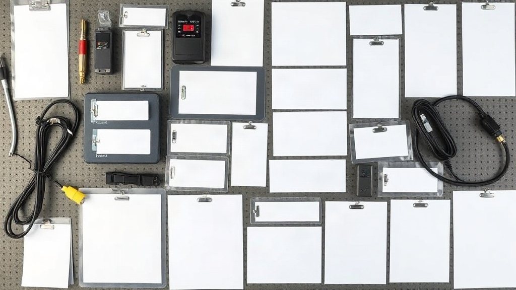
The size and shape of an asset label look like a trivial decision, the sort of thing you settle by grabbing whatever roll is nearest. In practice they are decided by the asset itself: how much flat surface it offers, whether that surface curves, how far away someone will stand when they read it, and whether the label has to carry a scannable code as well as text. Get the match right and every tag reads first time, scans cleanly and survives its environment. Get it wrong and you are left with labels that will not stick, barcodes that will not scan, and text nobody can make out from the aisle.
The reassuring part is that the constraints are few and knowable. Once you learn to read an asset for the handful of things that actually decide label size and shape, the choice stops being guesswork. This piece walks through those constraints in turn, then shows how to lock the result in once so every tag prints consistently.
Start with the surface, not the label
The first question is never "what size label do I like?" but "what flat, clean area does this asset actually offer?" A server chassis gives you a broad panel to work with; a network switch might offer a narrow strip above the ports; a laptop lid is generous but shared with vents and branding. Measure the largest uninterrupted rectangle the asset presents, subtract a little for the screws, seams and ventilation you must avoid, and you have the real ceiling on label size. Anything larger will overhang an edge, wrap onto a face it should not, or sit half over a gap and peel within a week.
This is also where surface texture and material enter the decision, which is why size and durable label materials are best chosen together rather than one after the other. A rough, powder-coated cabinet or a low-energy plastic resists adhesion, and the honest answer is often a slightly smaller label with a more aggressive adhesive rather than a large one that lifts at the corners. Reading the surface first saves you from designing a beautiful tag the asset cannot hold.
Read distance decides the smallest legible tag
The distance at which a label will be read sets a floor under its size that has nothing to do with the surface available. A laptop is tagged and read at arm's length, so small text and a compact code are fine. A rooftop chiller, a warehouse rack or a high-mounted distribution board is read from several metres away, and text that is comfortable in the hand becomes an illegible smudge at that range. If people will squint, walk closer, or give up and guess, the label is too small for its job however tidy it looks on the bench.
A useful habit is to decide the reading distance before the dimensions, then size the largest element — usually the human-readable ID or the asset name — so it stays clear at that range. Large plant read from the floor wants bold characters and a generous tag even when the surface could accept something dainty; equipment handled up close can stay small and unobtrusive. The label exists to be read, so let the moment of reading, not the appearance of the design, decide how big the important characters have to be.
When a barcode joins the party
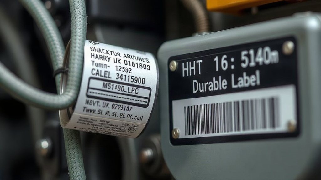
Everything changes the moment the label has to carry a scannable code. A line of text can shrink almost indefinitely and still be squinted at, but a barcode or QR code has a hard minimum below which a scanner simply refuses to read it. That minimum is set by the narrowest bar or the smallest square — the module — which must stay above the resolution your printer and scanner can resolve. Shrink the code past that point to make it fit a cramped label and you have not saved space; you have printed a decoration that no scanner will accept.
Just as unforgiving is the quiet zone, the blank margin a code needs on its sides so the scanner can tell where it begins and ends. Crowd text, a border or the edge of the label right up against the bars and reads become slow and unreliable even when the code itself is a legal size. So when a code is present, size the label around the code first: give it enough width for a scannable module, ring it with clear quiet-zone margin, and only then fit the human-readable text into whatever room is left. The code, not the text, is the demanding tenant here.
Round, narrow and awkward surfaces
Flat panels are the easy case. The interesting decisions arrive with cables, pipes, cylinders and the small round bodies of sensors and adaptors, where a conventional rectangular label will not lie flat at all. A cable tagged with a stiff flat label ends up with the label bowed off the surface, catching on everything and lifting at the ends. The shapes that solve this are wrap-around labels that circle the cable and stick to their own tail, and rat-tail flag labels that wrap a short way then join into a flat protruding flag you can print and read on both sides. The flag carries the text and code; the wrap holds it on.
Curved and cylindrical plant — a pipe, a bottle-shaped actuator, a small motor — asks a related question: over how much curve must the label conform? A gently curved cabinet door tolerates an ordinary label, but a tight radius wants a smaller or narrower tag so the printed area sits on the flattest part and the ends are not forced to lift. Matching the shape of the label to the geometry of the surface keeps the printed information on a plane the eye and the scanner can actually take in.
Outdoor and read-from-distance assets
Assets that live outdoors or high up combine two demands that both push the label larger. They are usually read from a distance, which raises the floor on character and code size, and they endure sun, rain and temperature swings, which favours a robust tag with room for a generous printed area rather than a cramped one crowded to its edges. A gate motor, an external meter, a compound light or a yard tank all read better and last longer as a slightly larger, bolder tag than a neat small one that fades and blurs at the range it is actually viewed from.
The place these assets go wrong most often is placement as much as size, so the two deserve to be decided together — a well-judged tag stuck where sun, spray or a moving part attacks it fails as surely as one that was too small. It is worth reading the common label placement mistakes alongside sizing, because the right size on the wrong face and the right face at the wrong size both leave you back at a tag that cannot be read.
Standard size families and the margin that saves them
You do not need a bespoke dimension for every asset. Most organisations settle on a small family of standard sizes — a tiny one for cables and small electronics, a medium one for the bulk of portable equipment, and a larger one for plant and outdoor assets — and assign each asset type to the nearest fit. A short, deliberate list of sizes keeps your label stock manageable, your printing predictable and your tags visually consistent, while still covering the genuine range of surfaces you meet in the field.
Within each of those sizes, the single most valuable discipline is to leave margin. A quiet zone around any code, a little breathing space around the text, and a clear border to the label edge are not wasted millimetres; they are what keeps the tag readable when it is printed slightly off-register, applied by hand a touch crooked, or scanned at an angle in poor light. The most common sizing mistakes all come from surrendering that margin — a code shrunk until it will not scan, text pushed so large it runs off the edge, a design crowded until nothing has room to breathe.
The failures below recur across almost every organisation, and each traces back to one of the constraints above being ignored.
| Mistake | What it looks like | The fix |
|---|---|---|
| Label too small for the code | Barcode shrunk to fit; scanner refuses it | Size the label around the code's minimum module first |
| No quiet zone | Text or border crowds the bars; slow, unreliable reads | Ring every code with clear margin on all sides |
| Unreadable at distance | Neat small text illegible from the aisle or the floor | Set size by reading distance, not by how it looks in hand |
| Flat label on a round surface | Tag bows off a cable or pipe and lifts at the ends | Use wrap-around or rat-tail flag shapes for curves |
How to size a label without regret
- Measure the largest clean, flat area the asset actually offers before choosing a size.
- Let reading distance set the floor on your text and code size.
- When a code is present, size the label around its minimum module and quiet zone first.
- Match the shape to the surface — wrap-around and flag labels for cables and curves.
- Standardise on a small family of sizes and always leave margin.
Bringing it together
Choosing label size and shape is really an exercise in reading the asset honestly: the flat area it offers, the curve it presents, the distance it will be read from, the code it must carry and the weather it must endure. Work through those in order and the right dimensions almost announce themselves — large and bold for plant read from afar, wrapped or flagged for cables and pipes, sized around the code wherever one appears, and always with margin to spare. A short standard family of sizes then keeps the whole scheme consistent without a bespoke decision for every item.
The final step is to stop making the choice by hand each time. Set the exact width, height and shape once per asset type in Designer Studio, build in the quiet zone and margins, and every tag of that type prints identically from then on — no drift, no shrinking a code to fit, no crooked one-offs. If you would like to define your sizes once and have every label come out the same, you can start a free 14-day trial and set your label templates in a few minutes.