
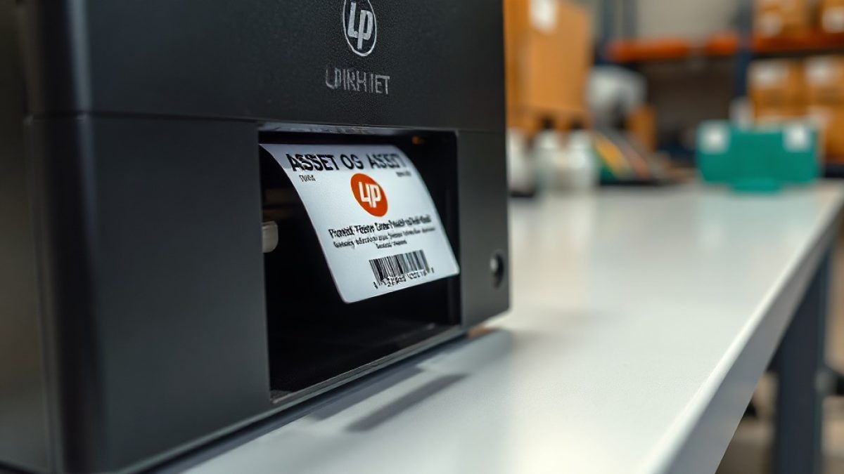
An asset label does more than carry a barcode. Every time someone scans a monitor, a generator or a company vehicle, they see the sticker, and that sticker quietly says something about your organisation. A crisp label with your logo tells staff and visitors that these assets are owned, tracked and taken seriously. A smudged, generic barcode says the opposite. Branding your labels is one of those small touches that costs almost nothing yet changes how people treat the equipment around them.
There is a practical side too. Branded labels are harder to fake, easier to spot in a mixed pile of equipment, and instantly identifiable when an item turns up at another branch or is recovered after a loss. In this guide we will walk through adding your logo and brand identity to asset labels in Designer Studio without wrecking the readability that makes a label useful in the first place. The goal is a label that looks like you and still scans on the first try.
Why branding on labels is worth the effort
People look after things that clearly belong to someone. An unbranded barcode on a laptop feels anonymous, almost disposable, but the same laptop carrying your logo feels accounted for. That perception matters in busy environments where equipment moves between hands constantly. A branded label is a gentle, permanent reminder that this item is on a register, has a custodian, and will be missed if it disappears. The psychology is subtle but real, and it costs you nothing beyond a few minutes of design work.
Branding also pays off during recovery and audits. When a device is found in a store room, handed in by a member of the public, or spotted at a partner site, a logo turns a mystery object into obviously-yours property. Auditors move faster when every asset visibly ties back to one organisation, and thieves are discouraged when equipment is plainly marked. In markets where second-hand resale is common, a clear brand on the label makes an asset noticeably less attractive to move on quietly.
Get your logo ready before you open the designer
The single biggest mistake people make is dropping a full-colour, high-detail logo onto a tiny thermal label and wondering why it prints as a grey smudge. Thermal printers work in pure black and white with no shades in between, so preparation matters. Before you touch Designer Studio, produce a clean, high-contrast version of your logo: solid black on transparent, simplified so that fine lines and gradients do not vanish at small sizes. A monochrome mark almost always reads better on a label than the glossy version from your website.
Resolution is the other half of the equation. A logo that looks sharp on screen can turn jagged when scaled to fit a 25mm label, so start from the largest, cleanest source file you have. If your only logo is a low-resolution web image, it is worth asking a designer for a proper vector version, because that single file will serve every label you ever print. Getting these basics right once saves you from re-doing hundreds of stickers later when someone notices the branding looks rough in person.
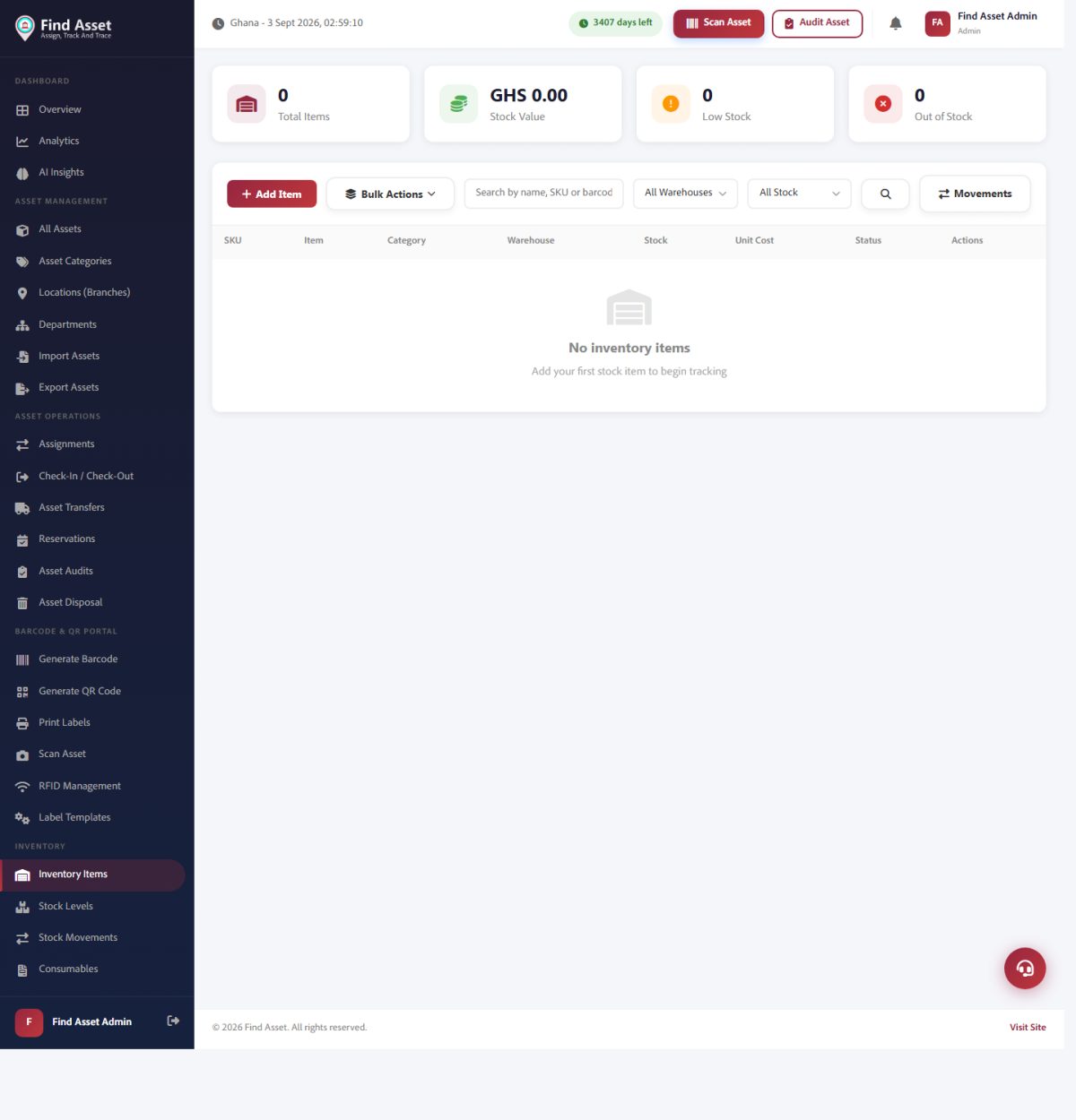
Adding a logo to a label is partly about ownership. Find Asset tracks that owned inventory (above), and a consistent branded tag on each item makes it obvious at a glance which organisation a piece of equipment belongs to.
Placing the logo without crowding the barcode
Space on an asset label is precious, and the barcode always wins. A scanner needs a clear quiet zone, the blank margin around a barcode, to read reliably, so your logo must never encroach on it. The safest layout puts the logo in a header strip across the top or tucked into one corner, well clear of the code itself. Think of the label as having zones: identity at the top, machine-readable data in the middle, and human-readable text beneath. Keep those zones from bleeding into one another.
Size discipline helps here. A logo does not need to be large to do its job; it only needs to be recognisable. On a small label, a logo occupying more than a fifth of the surface will crowd everything else and force the barcode smaller than it should be. The same layout principles from our guide to designing a small asset label layout apply directly: every element earns its space, and the barcode's readability is never negotiable no matter how nice the branding looks.
Label branding done right
- Prepare a clean, high-contrast monochrome version of your logo first
- Start from a vector or high-resolution source so it stays sharp when scaled
- Keep the logo clear of the barcode's quiet zone at all times
- Test-print and scan before committing to a full batch
Colour, contrast and the reality of thermal printing
Everyone wants their brand colours on the label, and this is where expectations meet hardware. Direct thermal and standard thermal-transfer printers, the workhorses of asset labelling, produce a single ribbon colour, usually black. If brand colour is essential you can buy coloured ribbon or pre-printed stock, but for most organisations the honest advice is to embrace black and white and let the logo shape carry the identity. A strong monochrome logo is far more effective than a muddy attempt at full colour on the wrong printer.
Contrast is what actually keeps a label scannable over its lifetime. Labels live hard lives, exposed to sunlight, dust, cleaning chemicals and constant handling, and a faint print fades fast. Always aim for the darkest, cleanest print your printer can produce, and choose durable label material for assets that live outdoors or in workshops. The table below summarises which branding choices survive real conditions and which look good on day one but disappoint within months of daily use.
| Branding choice | How it holds up in practice |
|---|---|
| Monochrome black logo on white | Excellent, high contrast, scans reliably for years |
| Full-colour logo on thermal printer | Poor, prints as grey mush, avoid unless using colour ribbon |
| Small corner logo, large barcode | Best balance of brand identity and scan reliability |
| Logo overlapping the barcode quiet zone | Fails, scanners struggle or refuse to read the code |
Building a reusable branded template
The real payoff comes from turning your branded design into a template you never have to rebuild. Once you have a layout you like, with the logo placed, the barcode sized and the text fields mapped, save it as your standard asset label. From then on, printing a branded label for a new asset is a matter of selecting the template and letting the data populate automatically. Consistency across thousands of assets is what makes branding look intentional rather than accidental, and templates are how you achieve it without effort.
A well-built template also enforces the discipline we have discussed. When the logo placement, contrast and barcode sizing are baked in, no individual user can accidentally crowd the code or stretch the logo out of shape. If you are still refining your underlying label design, our walkthrough on how to design a clean Zebra label pairs perfectly with this branding step, giving you a solid foundation before you layer your identity on top of it.
Test, scan and roll out with confidence
Never commit to a full print run on the strength of an on-screen preview. Print one label, stick it on a real asset, and scan it from a few angles and distances with the same device your team uses in the field. Screen previews flatter designs that fall apart in print, and it is far cheaper to catch a crowded barcode or a faded logo on label number one than on label number three hundred. Treat that first physical proof as a mandatory step, not an optional nicety.
Barcodes themselves are a mature technology with well-understood tolerances, and it is worth understanding the basics of how a barcode is read by a scanner so your branding choices respect them. Once your proof label scans cleanly every time, you can roll out across your whole asset base knowing every sticker will both look the part and do its job. That combination, professional appearance and flawless function, is exactly what good asset labelling should deliver.
Bringing it together
Adding your logo to asset labels is a small effort with an outsized return. It signals ownership, deters theft, speeds up audits and makes recovered equipment obviously yours, all without sacrificing the scan reliability that makes a label worth printing. The recipe is simple: prepare a clean monochrome logo, respect the barcode's space, favour contrast over colour on thermal hardware, and lock your winning design into a reusable template so every asset looks consistent.
Branded labels are most powerful when they sit on top of a well-organised asset register, because the sticker is only the visible tip of a proper tracking system. If you want to design branded labels and manage the assets behind them in one place, you can start a free 14-day trial and experiment with Designer Studio using your own logo and equipment. A few test prints will show you just how much a branded label changes the way your organisation sees and safeguards its assets.