

A QR code is a promise you make to whoever scans it later. It says: point a phone at this square, and the right information will appear — the asset it belongs to, the record it opens, the person it should be returned to. When the promise holds, an audit turns into a walk down a corridor with a phone. When it breaks, you get tags that will not scan and codes nobody trusts, which is worse than no code at all because it invites people to stop trying.
Adding a QR code to a label in Designer Studio takes minutes. Designing one that scans reliably for years — on the right asset, at the right size, encoding the right thing — takes a little more thought, and that thought is what this guide is about.
Decide what the code should encode before you draw it
The most common mistake is reaching for the QR tool before answering the only question that matters: what should happen when someone scans this? A QR code is just a container for a short string of text, and the string you choose determines everything the label can do. There are really three sensible choices, and they are not interchangeable. You can encode the asset tag itself — a plain identifier like LAG-IT-LAP01 — which is compact and offline-friendly and reads the same on any scanner. You can encode a URL that opens the asset's record directly, so a scan takes you straight to the history, location and status inside Find Asset. Or you can encode return or contact information, so a member of the public who finds a lost item knows who to call.
Each of these serves a different reader. The plain asset tag is for your own team working inside a system that already knows what that tag means; the scanner reads the code, the app looks it up, and you are done. The scan URL is for the moment you want the record to appear with no app in between — useful for auditors, contractors or anyone who should see the asset but not the whole system. Return information is for assets that leave the building. Choosing deliberately here is the difference between a label that quietly does one job well and one that tries to do three and confuses everyone. If you are still weighing formats at all, it is worth reading QR versus 1D barcodes before you commit a whole batch to one shape.
Bind the QR to the dynamic asset-tag field
Here is the part that separates a real asset-labelling workflow from a poster of a single code. In Designer Studio, when you drop a QR object onto the canvas, you do not type a fixed value into it. You bind it to a dynamic field — the asset tag, or a URL built from the asset tag — so that the code re-renders for every record the design touches. One design, hundreds of unique codes. The moment you print a batch, each label carries the QR for its own asset, and no two are the same.
This matters because the alternative — pasting a static code and printing it many times — produces a stack of identical labels that all point at the same asset, which is the single most expensive labelling mistake there is. Binding to the field means the uniqueness is guaranteed by the data, not by anyone remembering to change a value between prints. It also means the human-readable text and the QR always agree, because both are drawn from the same field. When you are ready to run the whole set, the mechanics of turning one bound design into a full sheet are covered in print hundreds of labels from one design, and the principle is the same for a QR as for any other dynamic element.
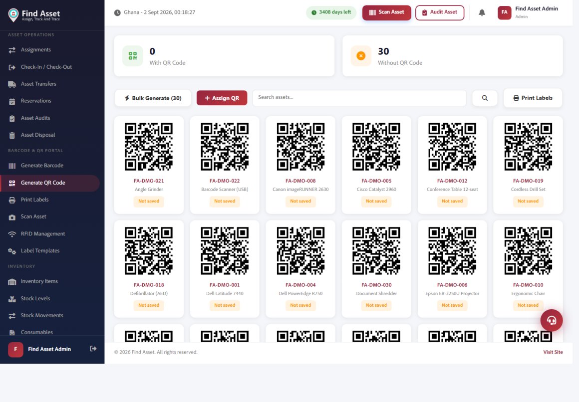
Find Asset can generate a QR code for every asset in one pass. The QR portal below shows the whole register with a scannable code per item; you can bulk-generate codes, assign them, and send them straight to the label printer. Each code resolves to that asset's live record, so a scan opens its history, owner and status — not just a number.
Choose a size that matches the scan distance
A QR code has a minimum size below which it simply will not resolve, and that minimum depends on how far away the phone will be and how much data the code carries. A short asset tag encodes into a sparse code with large modules — the individual squares — which stays readable when small. A long URL packs far more modules into the same area, so each one shrinks, and the code needs more physical size to scan cleanly. This is why a code that works beautifully on a monitor can fail on a printed label: the modules fell below what the printer and camera can resolve together.
The honest way to size a QR is to start from the scan distance and the content, not from the space left over on the label. A code scanned from a hand's length away on a laptop lid can be small; one scanned from a metre away on a rack of servers needs to be generous. Reserve enough of the label for the code to breathe, keep it square, and resist the temptation to shrink it to fit a crowded design — a smaller label with a reliable code beats a busy one with a code that scans on the third try.
| QR module size | Typical scan distance | Good for |
|---|---|---|
| Small (compact code) | Up to roughly a hand's length | Laptops, phones, small tools scanned up close |
| Medium | Arm's length | Desktop equipment, furniture, boxed stock |
| Large | A metre or more | Server racks, plant, shelving scanned while standing back |
| Extra large | Several metres | Vehicles, containers, wall-mounted assets |
Leave the quiet zone and set error correction sensibly
Two settings do more for reliability than any amount of resolution, and both are easy to get wrong. The first is the quiet zone: the empty margin of clear space around the code. A scanner uses that blank border to find where the code begins and ends, and if text, a logo or the label edge crowds right up to the modules, the camera loses the boundary and the scan fails. Designer Studio protects a quiet zone by default; the discipline is not to fill it. Keep a clear band around every code, treat it as part of the code rather than wasted space, and never let another element drift into it to save room.
The second setting is error correction. A QR code can carry redundant data so that it still reads when part of the surface is scratched, smudged or partly covered — at higher levels, a meaningful fraction of the code can be damaged and it will still resolve. The trade-off is that more correction means more modules in the same area, which makes each module smaller for a given label size. For clean indoor assets a modest level is plenty; for tags that live on machinery, get handled roughly, or sit outdoors, a higher level earns its keep. It is a genuine balance, not a free upgrade — turning correction all the way up on a tiny label can push the modules below what your printer resolves and defeat the point. If durability is your main worry, the thinking in the RFID smart label encoding guide is a useful companion, because the same assets that need rugged QR codes are often candidates for smart labels too.
Keep contrast high and the code dark on light
Scanners read QR codes as a pattern of dark modules on a light background, and they expect exactly that polarity. Dark ink on a pale label is what every camera is tuned for. Reversing it — light modules on a dark field — works on some readers and fails on others, and there is no reason to gamble on it for an asset tag that has to scan every time. Plain black on white or black on a very light stock is the reliable choice, and it also happens to be the cheapest to print.
Contrast is quietly undermined by things that seem harmless at design time. A tinted label stock, a watermark or a background image behind the code all reduce the difference between module and gap that the scanner depends on. If you are adding brand colour to a label — and there are good reasons to, as adding logo and branding to asset labels explains — keep it away from the QR itself. Let the colour live in the header or border and give the code a clean white field of its own. A branded label with an unscannable code is not branded, it is broken.
Place the code beside human-readable text
A QR code should never be the only thing on the label, because scanners fail, phones die, and sometimes a person just wants to read the tag with their eyes. Every asset label should carry the asset ID in plain, legible characters alongside the code, so the label is useful whether or not anything is scanning it. The QR is the fast path; the printed identifier is the fallback that keeps the label honest.
Arrangement matters more than it looks. Put the human-readable asset ID directly beneath or beside the code so the two are unmistakably paired, and keep a short description or the owning location nearby so a found asset can be understood at a glance. Because the code and the text are both bound to the same asset-tag field in Designer Studio, they will always match — but the layout is what makes that match obvious to a person holding the label. The broader craft of arranging these elements cleanly is the subject of how to design a clean Zebra label, and it applies directly the moment a QR joins the design.
Before you print the batch
- Decide deliberately whether the QR encodes the asset tag, a record URL, or return information — one job, not three.
- Bind the QR to the dynamic asset-tag field so every label in the run is unique from a single design.
- Size the code for its real scan distance and content, not for the space left over on the label.
- Protect the quiet zone and choose an error-correction level that matches how roughly the asset is handled.
- Keep the code dark on a light field, paired with the human-readable asset ID.
Test one scan before you commit the whole run
The cheapest insurance in the entire process is printing a single label and scanning it before you print the rest. What looks perfect on screen behaves differently once ink meets stock: modules can bleed, contrast can flatten, and a code that resolved instantly on the monitor can hesitate on paper. One physical test with the actual printer, the actual label stock and an ordinary phone catches nearly every problem while it still costs one label instead of a thousand.
Test the way the label will really be used. Scan it from the distance and angle a person will scan it in the field, in the lighting that room actually has, with a normal phone rather than a dedicated reader if that is what your team carries. Confirm that the code resolves to exactly what you intended — the right record, the right tag — and not merely that a scanner beeps. The QR standard is a well-documented and forgiving format, but the failure points are always physical: size, contrast, quiet zone and print quality. If you want the underlying detail, the QR code reference is a solid neutral primer on how the encoding and error correction actually work.
Bringing it together
A good QR asset label is not a clever square you add at the end; it is a small set of decisions made in the right order. Choose what the code encodes, bind it to the asset tag so uniqueness is guaranteed by data rather than diligence, size it for the distance it will really be scanned from, leave it a quiet zone and honest contrast, sit it beside human-readable text, and prove one scan before you print a thousand. Do those things and the label keeps its promise for years, through audits and moves and the ordinary wear of being handled.
Designer Studio is built to make each of those steps deliberate rather than accidental, so the whole batch inherits the care you put into one design. If you would like to try it against your own assets, you can start a free 14-day trial, drop a QR object onto a label, bind it to your asset tag and print a test in the next few minutes. The best time to get a label right is before you print it — and the second best is now, before the next audit reminds you why it mattered.